Istanbul Stopover & Large Print Photo Guide
The Weekly Frame #32: June 18th, 2026

Hi friends,
I'm writing this from Istanbul. Kyrgyzstan ended on Monday and I came straight here for a short stopover with Turkish Airlines before heading home. By the time you're reading this I'll either be at the gate or already in the air.
The contrast between the two places is actually insane. One week I’m in a 4Runner crossing alpine passes with no cell service, and the next I'm walking through a city of 16 million with a coffee in one hand and a camera in the other.
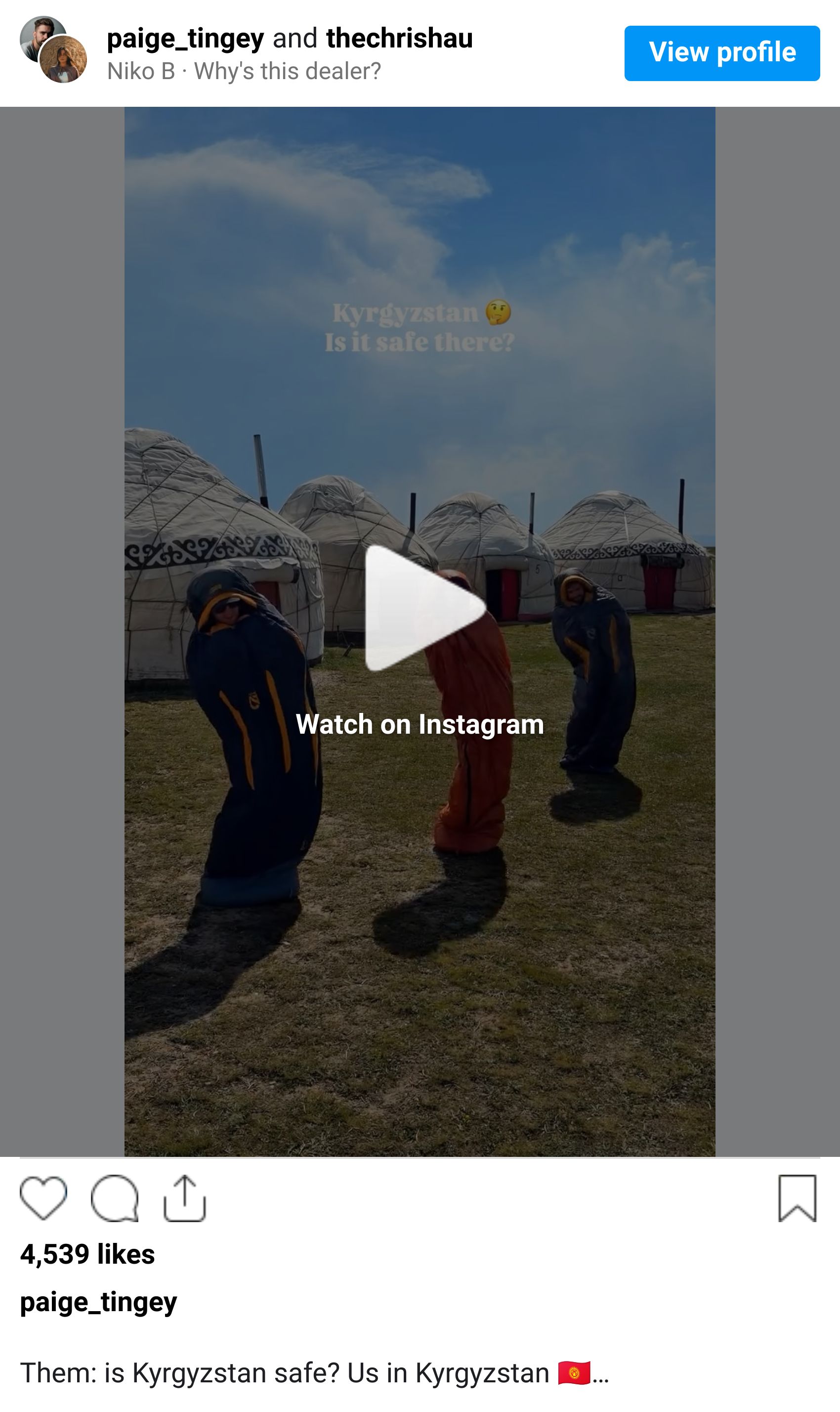
I shared a couple of Kyrgyzstan reels on Instagram this week while I was waiting out drives, so check them out if you haven't yet. The full debrief, with photos I'm genuinely proud of, is still a week or two away.
For this week, I want to answer a question I’ve received multiple times now in your email replies: how do you actually save your photos for large prints without losing quality?
Tip of the Week: How to Save Your Photos for Print (Without Losing Quality)

Saving a file for print is a different job than saving one for Instagram, and most photographers use the same export settings for both. That's usually the moment quality starts to disappear.
A few things that have changed the way my prints come out:
1. Export at full resolution, not screen resolution.
Long edge at 4000px is fine for the web. It's not fine for a 24x36 print. For anything you might want to print, export at the original pixel dimensions of your file, or as close to it as your camera allows.
2. Use 300 PPI, not 72.
The screen doesn't care about PPI. The printer does. 300 is the standard most labs assume. Anything lower and you're asking the printer to invent detail it doesn't have.
3. Export as TIFF for the lab, JPEG for everyday.
TIFF is uncompressed, which means no quality loss from save to save. Most professional print labs want a TIFF or a maximum-quality JPEG (quality 100, sRGB or Adobe RGB depending on the lab's requirement). Ask the lab what they prefer before exporting.
4. Pick the right color space.
sRGB is safe for web and most consumer print labs. Adobe RGB has a wider color gamut and is better for fine-art prints if the lab supports it. ProPhoto RGB is wider still but only worth using if you're working in a fully color-managed workflow.
5. Sharpen for output.
Lightroom has an "Output Sharpening" option in the Export panel. Set it to "Matte Paper" or "Glossy Paper" depending on what you're printing on, and choose Standard. It's a tiny extra step that makes a noticeable difference once the print is in your hands.
The shortest version: shoot in RAW, edit in 16-bit, export at full resolution at 300 PPI, deliver as TIFF when the lab asks, and turn output sharpening on. Five small things, but together they're the difference between a print you frame and a print you don't.
What's Happening in Photography Right Now

Adobe shipped its June Creative Cloud update this week. The biggest item for photographers is AI Sharpen, which integrates Topaz Labs' Noise-Aware Sharpen model directly into Lightroom without needing an export step. Assisted Culling is now generally available with a new Face View, Select Subject moves to version 5 for better masking on hair and fine detail, and Photoshop's Remove Tool now runs entirely on-device for the first time, no internet required.
Fujifilm opened applications for the 2026 GFX Challenge Grant Program on June 16. The program awards five $10,000 Global Grants and ten $5,000 Regional Grants, plus mentorship and loan use of the GFX ETERNA 55 cinema body and two GF lenses. Applications run through August 17, 2026, with winners announced in January 2027.
Leica's long-rumored SL3-P is expected to be announced next week. Reports point to a June 22-25 launch window for the new full-frame mirrorless, with a rumored 44.3MP sensor sitting between the SL3 (60MP) and SL2-S (24MP), and a price around €5,900. If accurate, it's positioned as the more workable file-size option in the SL line.
Nikon US is raising prices on June 23. If you've been eyeing a Z-mount lens or body, this is the week to lock it in. The Z 70-200mm f/2.8 VR S II is among the lenses most likely to be affected based on recent retailer signaling.
Creator Highlight: Marc Adamus (American Landscape & Print Master)

Marc Adamus is an American landscape photographer based in the Pacific Northwest who has spent more than two decades photographing the wild places of North America, from the Wallowas to the Brooks Range. His work is the kind that doesn't trend on social media but ends up framed on collectors' walls.
What I find compelling about his practice, and why he came to mind for this week, is how seriously he treats the print. He shoots for the print first and the screen second, and you can feel it. His files are made to be lived with at scale, which is a different discipline than shooting for a feed that scrolls past in two seconds.
He's also one of the few well-known landscape photographers who openly teaches the print side of the craft, including paper choice, output sharpening, and the relationship between the file and the final piece on the wall. If you're curious about what photography looks like when print is the destination instead of the platform, his work is one of the best places to start.
Gear Worth Mentioning: Helinox Chair Zero (Ultralight Camp Chair)

This is one of those pieces of gear that feels like a luxury until you've used it once, and then you can't remember how you ever waited out golden hour without it.
The Chair Zero weighs about 1.1 pounds, packs down to the size of a water bottle, and sets up in under a minute. It holds up to 265 pounds, the seat sits about 11 inches off the ground, and it's stable enough on uneven terrain that I've used it on rock, sand, and snow without thinking about it.
For a landscape and travel photographer, the actual use case is patience. Sunrise that's still 40 minutes away. A milky way composition that needs an hour of dark adaptation. A wildlife setup where you're going to be quiet and still for as long as it takes. Standing for that long ruins the shot more often than people admit, because by the time the light is right, your back is wrecked and your composition has drifted.
(Full transparency: I earn a small commission through this link. It helps keep this newsletter free and my coffee mug full. Thanks for supporting!)
One More Thing…

This was a different kind of trip than the recent ones. Kenya was wildlife. Nepal was altitude and discomfort and the kind of beauty that gets earned over many days. Kyrgyzstan was something in between, with a softness I wasn't expecting, and Istanbul on top of it has been a reminder that I really do love big cities when I let myself slow down inside them. I'll have more to say about both once the photos catch up with the memory.
This week's question: Have you ever printed one of your own photos and felt let down by it? I'm curious what happened, whether it was a color shift, a softness issue, a paper choice you'd undo. I'd love to hear about it before I dive back into my own print queue.
See you next week,
Paige
P.S. Curious how I edit my photos? These are the exact presets I use for almost every travel & landscape shoot (designed for both mobile and desktop).
P.P.S. Some of my most popular travel and landscape shots are available as prints through Big Wall Decor. If you've ever wanted one on your wall, check them out here.